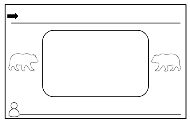
Here are two designs I have made for my classroom. The first will be a poster I place on our front entrance, as well as on my professional website, as a reminder. The second will be the brochure I send home with my learners on the first day of school or hopefully in their “Welcome to Kindergarten” Kits.


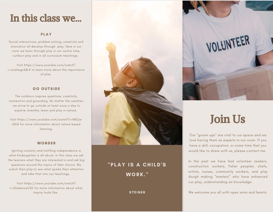
As a Kindergarten teacher, it is vital to show the intended learning in multiple ways. From my experience, most young learners cannot read written text and have both limited attention spans and long term memory. They are incredibly hands on and must be moving at most times. Therefore, images, video, interactions, play, tactile applications and oral storytelling is key to their engagement with, retention of and readiness for learning.
This is where the multimedia, signalling, spacial and temporal contiguity , coherence and self-explanation principles truly strengthen the learners understanding. When we add images to words, when we add cues to highlight important information, when we present words and pictures close together in time and space, when we exclude extraneous material, and when we encourage learners to create and generate self explanations, we provide our diverse learners access to a multitude of modes in which they can process and generate the intended information (McCue, 2021). Thus, the learner can digest, manipulate and recreate the information in a way that best suits them. An example of this would be to use Canva posters to connect to the Kindergarten curriculum. One of the curricular competencies speaks to knowing who you are and where you come from. To telling your own stories of your family and life. Therefore, learners could create an “About Me” poster which can express who they are through images and text, much as Omar did in his Blog. This would deepen the connection to to the creator’s self as well as gives others the chance to learn about them from their poster.
Not only are posters and brochures an effective way to provide information for learners and to have them connect to and demonstrate their understanding, so is the use of AR (augmented reality). Imagine how wonder and curiosity would be ignited if you got to hold the sun in the palm of your hands. If you got to look at it from all angles and truly feel as if it were right there. How engaged would you be if you knew you could experience something you may never have been able to do without AR? Imagine the excitement and readiness to learn you would have if you knew you would be surrounded by the gorillas you were learning about? AR in classrooms offers experiences that learners may never be able to encounter in their “real lives” and it provides tangible experience and connection to what they are learning. When added to the pre-existing styles of learning, it would only serve to enhance the motivation, retention and understanding of concepts. It would facilitate learners being at the centre of their learning and promote a larger sense of wonder.
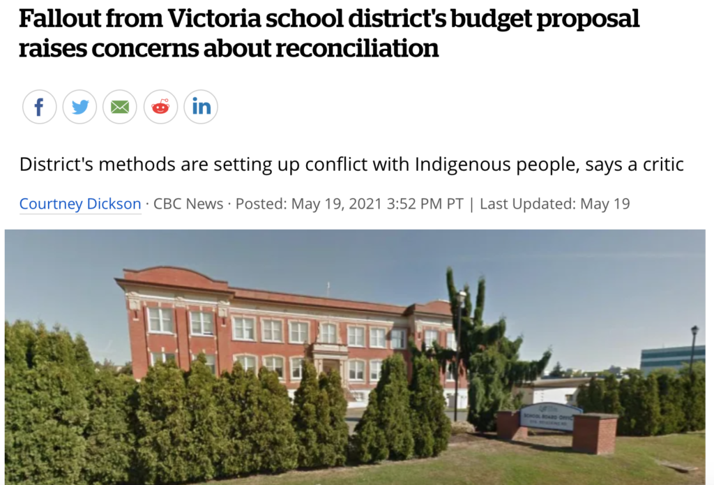
All that said, I can recognize the budget and accessibility truths of the school system, as well as the importance to remain connected to our true realities. AR is expensive, will need certain maintenance and is continually changing. Therefore, when taking AR into considerations in elementary schools, it becomes difficult to weigh AR against a music curriculum. (The below article speaks to how the budget is needing to shift and they may have to remove the music curriculum to account for Indigenous Education. There are always very difficult decisions being made on where the budget is best allocated).
Budget aside, accessibility also poses a problem. I currently work at a rural school with limited access to internet. Therefore, running these programs is not always possible. Or it might be, but only if you are right beside the third window from the front of the classroom. Furthermore, there is always the fear of losing ourselves in AR and no longer being connected to the “real” which lives, breathes and grows beside us. If we go too far to AR, will our learners only want and appreciate that facet? Will we no longer travel and experience things in life because we can simply “experience it” from the palm of our hands? Will our children be sitting right next to their counterparts and not even engage in meaningful conversation/ play/ connection?
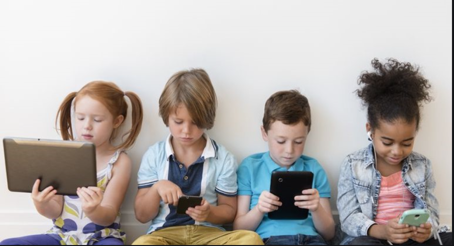
There is a fear that “reality” may be lost. However, I believe that no AR can truly mimic the authenticity of physically being somewhere, smelling or touching something. Therefore, as long as AR is balanced with “reality,” using AR in classrooms and in education, will help learners thrive. Balanced AR use will provide new experiences and opportunities which leaners may otherwise never been able to have, excite and enhance engagement and retention, and have our learners using technologies and acquiring skills which they will use in their futures.
Citation:
Dickson, Courtney (2021). CBC News. “Fallout from Victoria school district’s budget proposal raises concerns about reconciliation.” Retrieved from: https://www.cbc.ca/news/canada/british-columbia/victoria-school-district-budget-proposal-1.6032086
McCue, R. (2021, February 20). Introduction to Infographics with Canva & Related Multimedia Learning Principles [MP4]. https://www.youtube.com/watch?v=K1k3deWbw2c
Augmented Reality. (n.d.). Wikipedia. Retrieved May 26, 2021, from https://en.wikipedia.org/wiki/Augmented_reality

